We wanted to find a common issue amongst college students. So we want around asking students what difficulties they had while being in college.
Students’ responses were grouped in categories such as Advising, Communication/Transparency, Mental/Physical Health, Transportation, and Dining.
We chose to go along with Advising.
Advising had the most complaints and was something we believed a digital product could assist with.
Initial Research
Competitive Analysis
AdvisorTrac, Anthology – Blackboard and Navigate360 would be direct competitors, since I was thinking of an entirely separate platform dedicated to advising.
Career Explorer was a website that was more user input driven, telling people who takes their quiz their best career choice.
AdvisorTrac had great qualities like being able to see each student’s schedule, school information, and documents all in one place. While not too aesthetically pleasing, it does have a clearer design interface.
Navigate360 is another app dedicated to advising. Their interface is more aesthetically pleasing, letting the user use the sidebar to navigate.
It also has a clear and simple scheduling phase. You also can see a list of your advisors under “Appointments” > “My Team”
Career Explorer is a self assessment test to find the best career suited to your interests. There are about 30 questions and it takes up to 40 minutes, but gives great insight on what careers would be best for you and what majors/classes in college you should take to further that interest.
Surveys
I made a survey asking questions about student’s experience with advising. There were significant complaints about how advisors didn’t help students plan for their 4 years in uni to transfer into post-graduation successfully.
User Interviews
I interviewed 4-year advisor John Early about his opinions and experience with advising students.
I asked him the following:
What’s the hardest thing about advising for you?
What do you wish could be easier about advising?
Do you wish you had a certain software/app provided by the university that could help you with advising?
What’s the most common mistake you see with students?
What’s the most common concern students come to you about?
How can students plan for all four-years better at the beginning when they are freshman?
Any advice for students to make the most out of their advising? (how to take advantage of it in the most beneficial way)
These were the main points I took from his responses:
Needed a better online platform with all info for students
First-years narrow their field of study too soon too fast, not allowing themselves to explore other fields
Many questions and confusion about student’s completion of major—or minors + second majors
Students should look at sample curriculums for planning out all 4 years/8 semesters
The point that stood out most was how students should plan ahead for all 4 years/8 semesters of their college years, particularly from looking at sample schedules.
It made sense since previous responses from students talked about how they were unsure about their majors and wanted earlier guidance so that they didn’t have to figure everything out in their last semester before graduation.
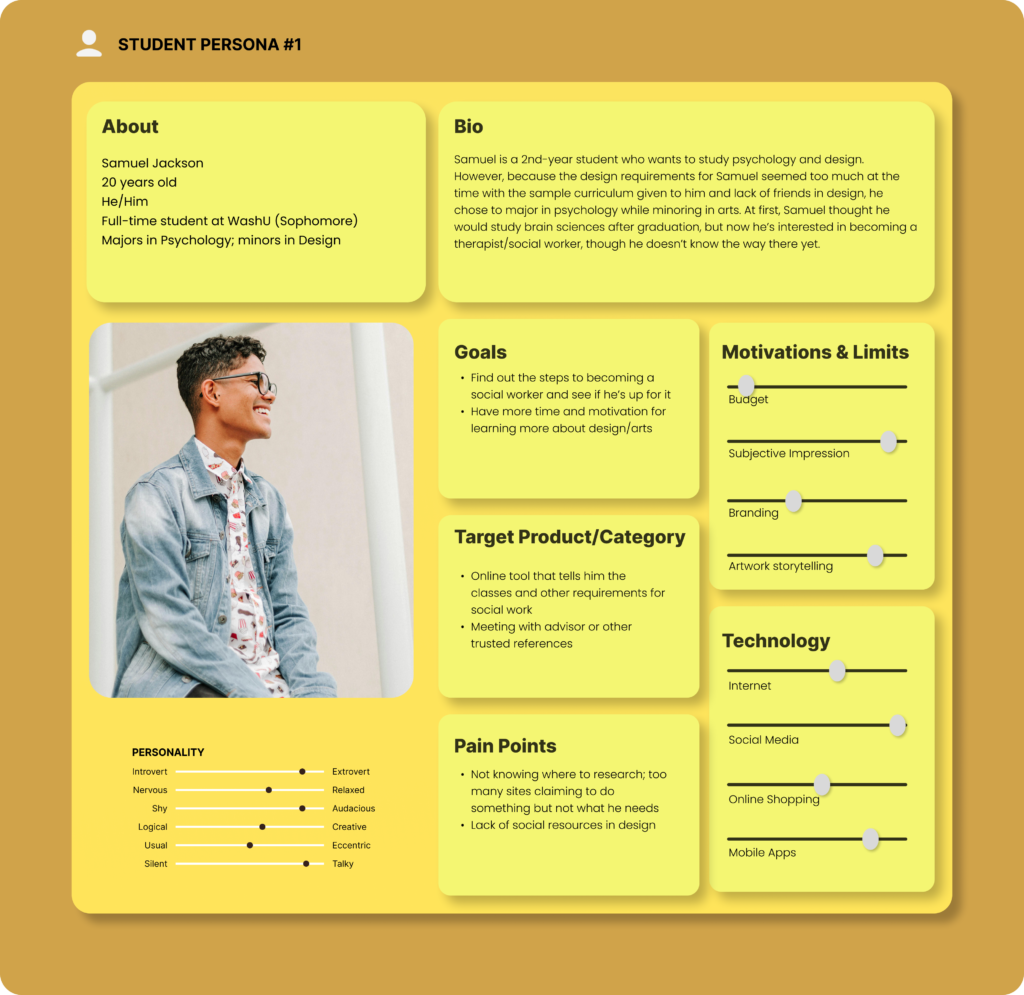
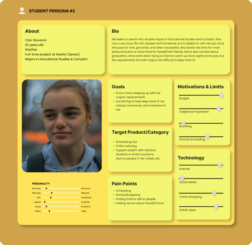
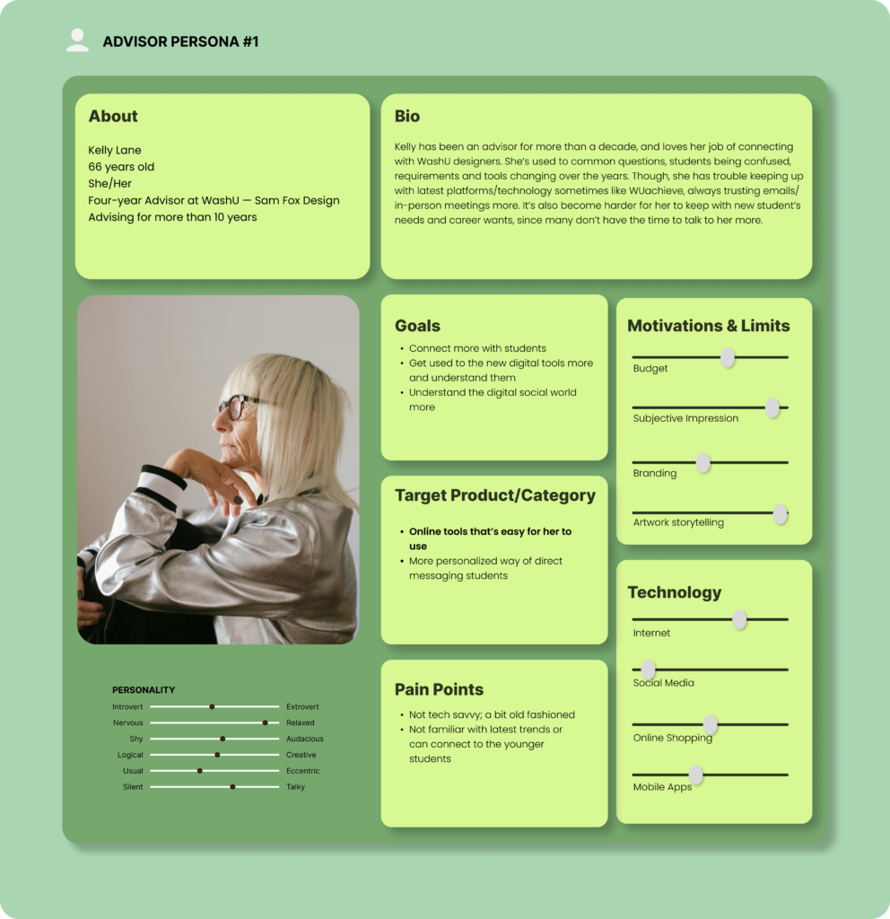
Personas
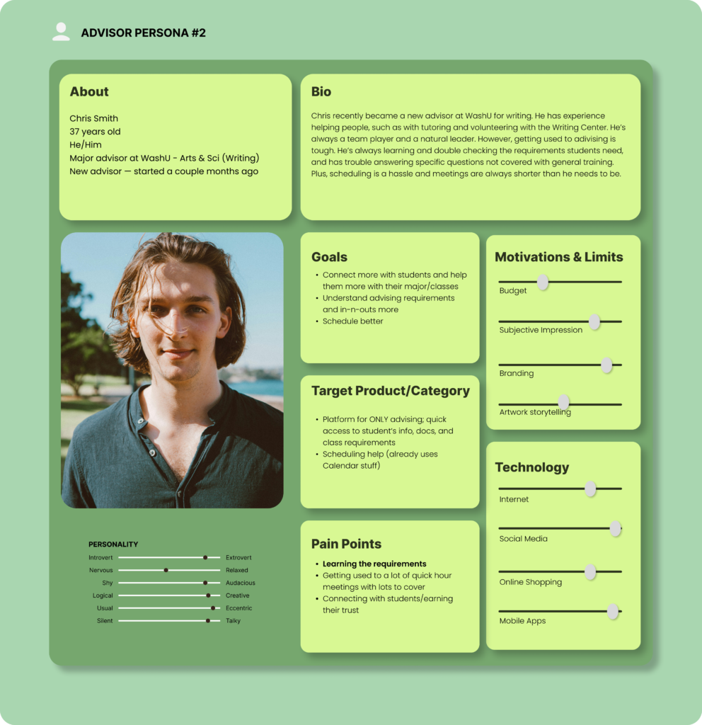
We developed four distinct personas for the advising process; two who were students and two who were advisors.
For each category, I tried making each persona as different from each other as possible.
Student Personas
Advisor Personas
Initial Solution
Madlibs
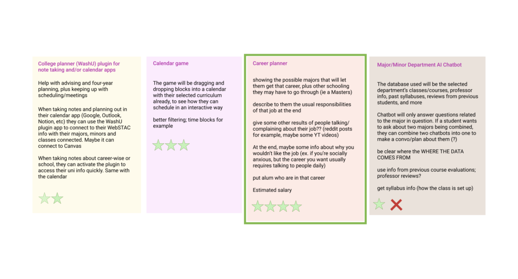
Based on the research, I came up with 4 initial digital products I could make:
College planner (WashU) plugin for note taking and/or calendar apps
Calendar game
Career planner
Major/Minor Department AI Chatbot
The most popular (and my personal favorite) idea was the career planner, which focuses on finding majors and/or courses best for the user based on their career interests.
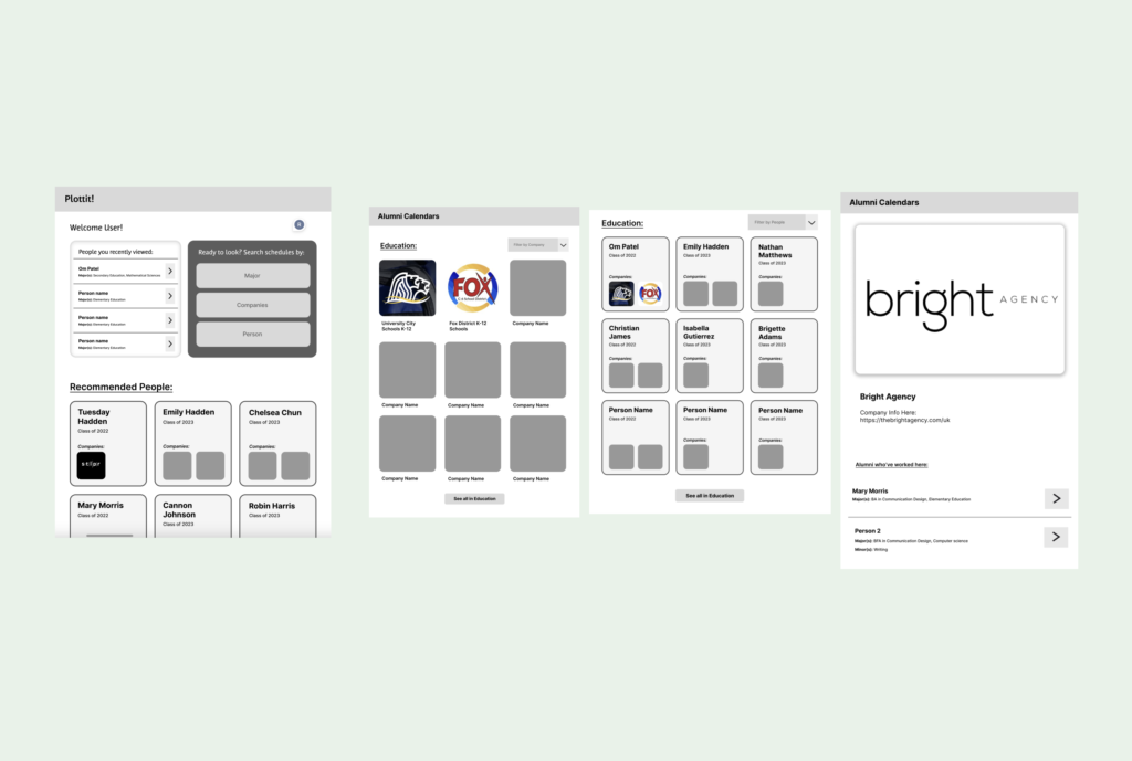
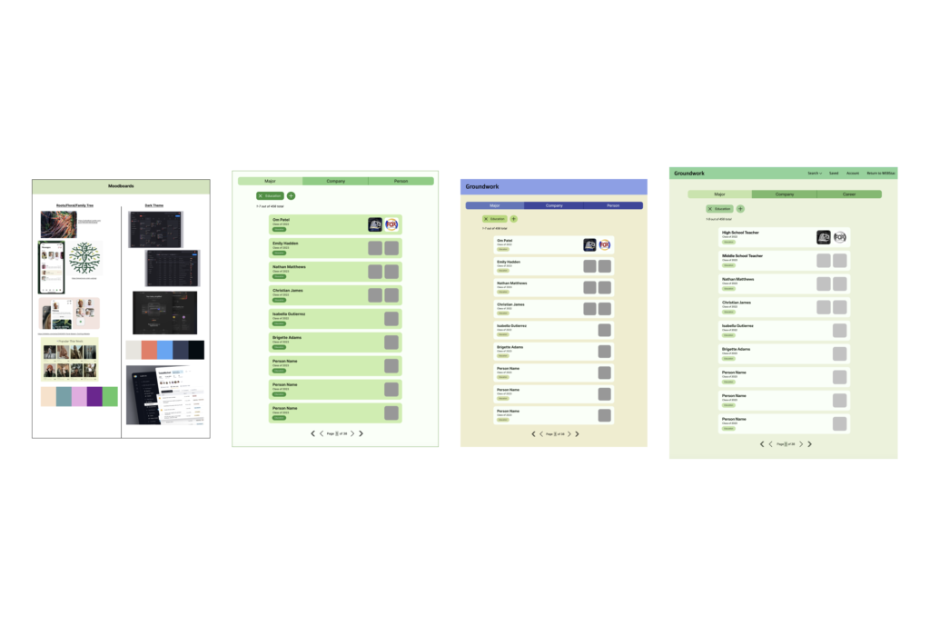
Lowfi Prototype 1
The lowfi prototype had a home page for the user to view recently viewed alumni schedules. Users could search for companies that alumni had previously worked in, or find individual alumni based on their major, and see the companies they previously worked at.
Then I revised the individual cards for each alum, as well as designing their individual pages. Their pages have a course view / calendar view for the classes the alum took per semester.
Themes and Color
I wanted to evoke a root/nature theme, since my app is directly tied to networking with alumni. I knew a primary color would be green.
First prototype journey
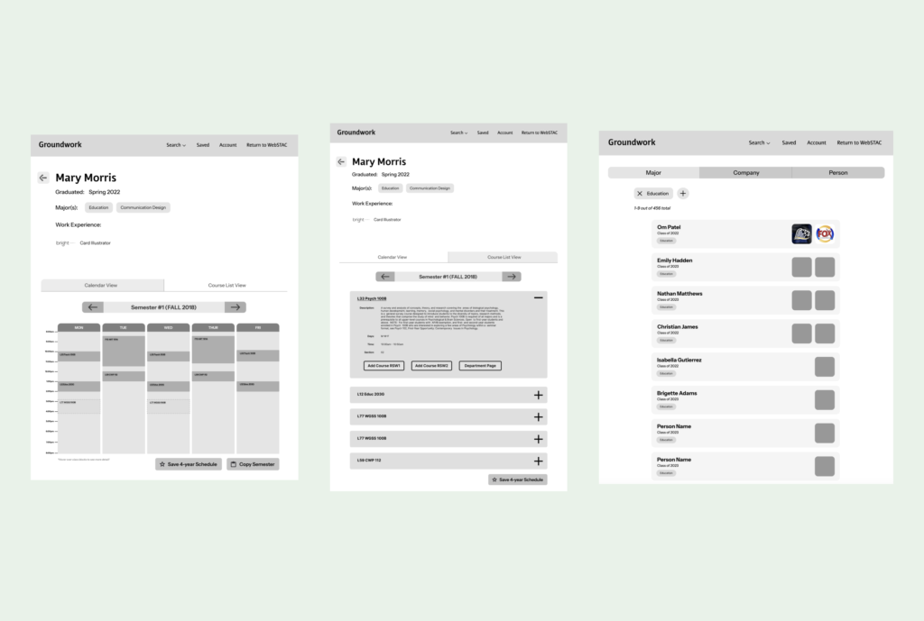
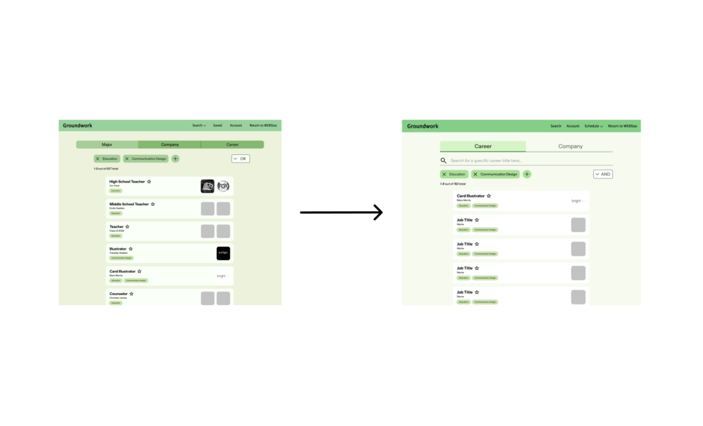
In this specific journey, a new user signs up for GroundWork and tries to find an alumni with a similar career interest of his in Education and/or Communication Design.
The user then views Om Patel’s schedule and decides to copy his courses, whether one semester or all 4 years, onto their own schedule. During the editing process, they can see all the semesters and their course load, able to add o remove certain courses along the way. Then they just click on “Copy” and they have a curated schedule based off a previous alum.
User Feedback
User Tasks Testing
Aside from asking users to go through the site and give feedback on the navigation process, I also asked them to complete some tasks to measure how fast and easy it was for them to complete it.
Copy an alum’s schedule, who majored both in Education AND Communication Design
Review each search function and decide which one you like best. Explain why
While copying a alum’s schedule, remove X course and add Y course.
Feedback
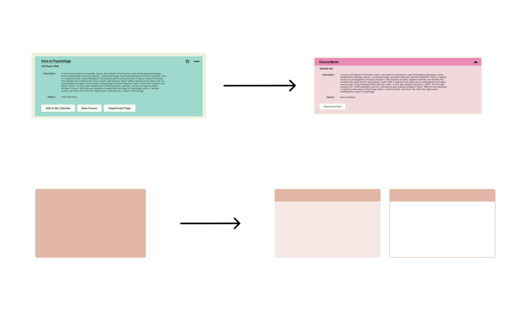
For the initial navigation through the site, users had several thoughts on the design
Background color is not attractive.
I changed from a yellow-green gray to a whiter greenish (more blue tones) white.
Course color and opacity along with typography.
I changed from a yellow-green gray to a whiter greenish (more blue tones) white.
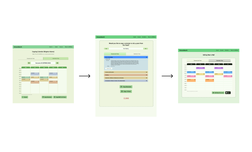
Editing mode is not obvious, and users were confused when and how they were in editing mode.
At first, I decided to just add a sort of dashed background with a darker color. But to add more into it, I made the calendar tabs into dark mode.